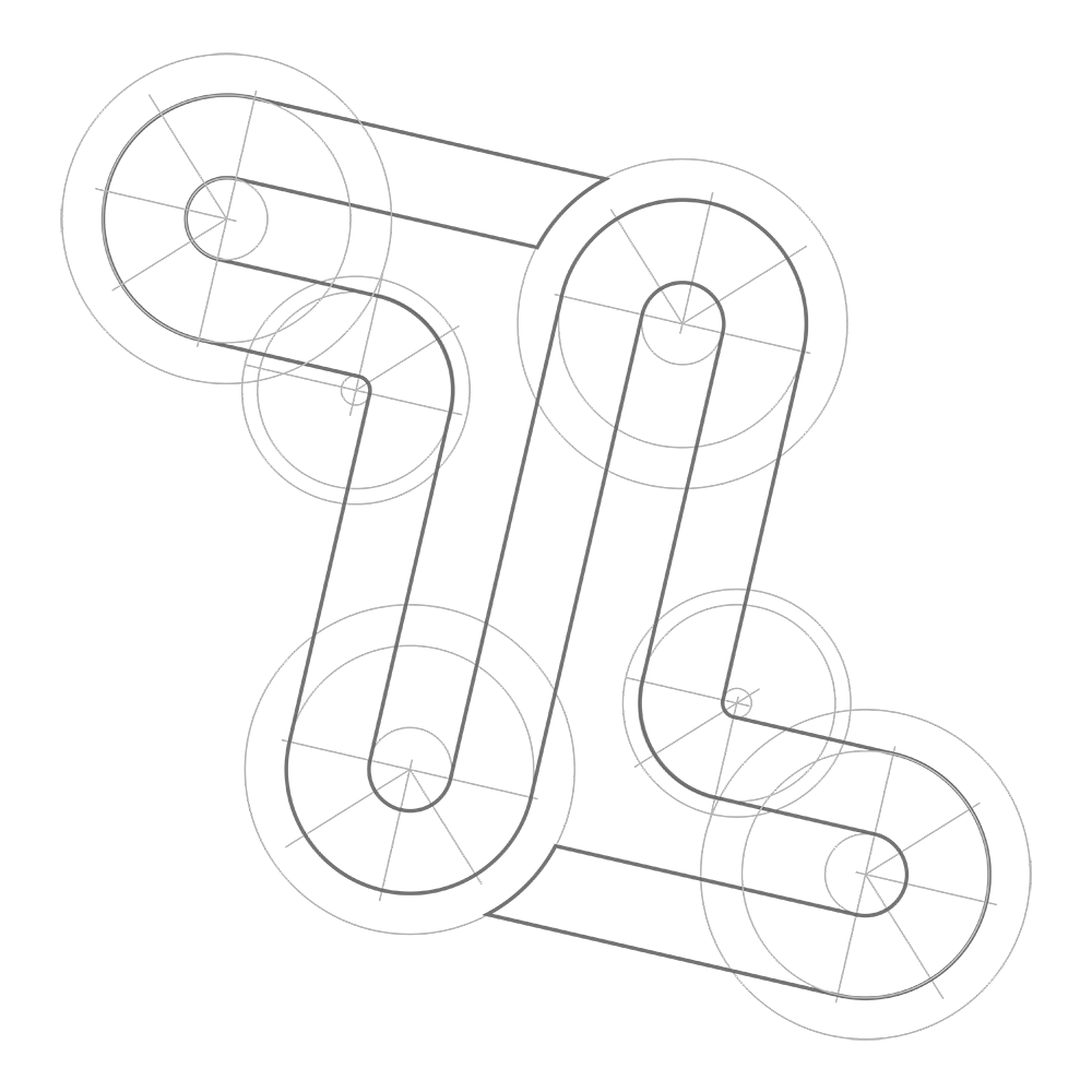
Shape and proportions
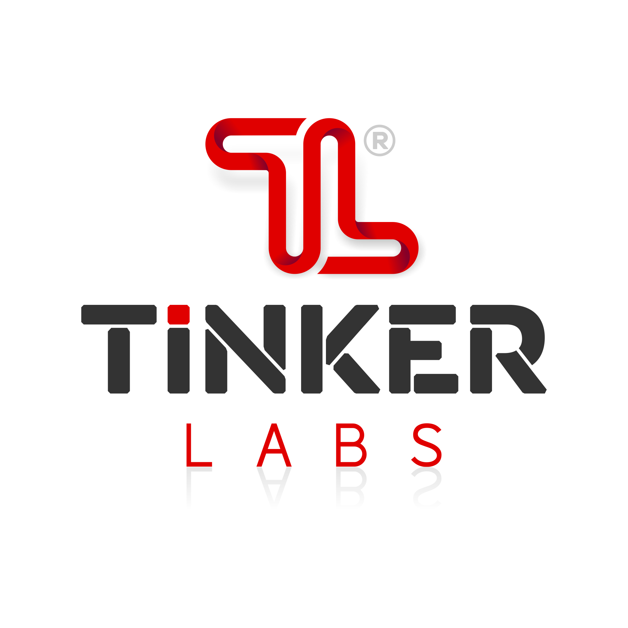
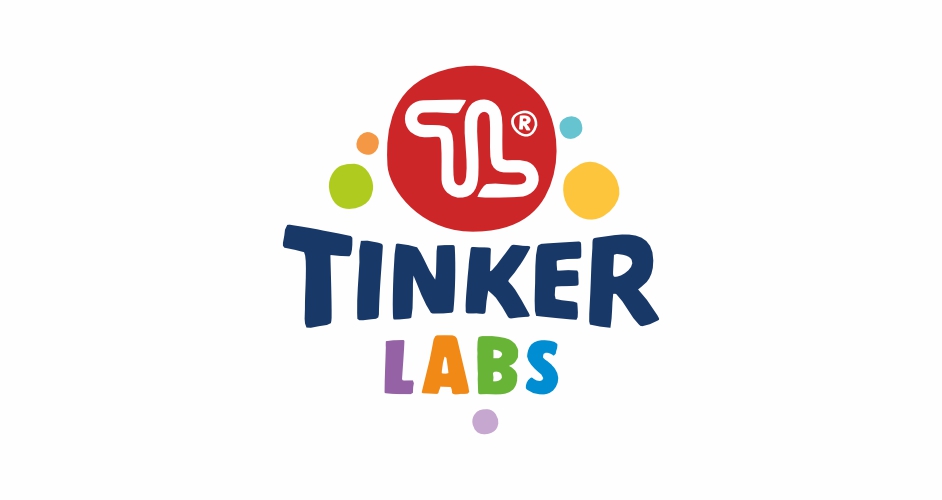
Primary appearanceThe logo has a compact shape of approximately equal width and height, the ratio of which must not be changed without exception. All spaces between elements are constant in the same ratio. All artistic and typographical elements are combined into one artistic whole and only in rare situations are they shown separately as independent elements. It is not allowed to deform, draw, or redraw the logo in any way, but only use downloaded visuals. The logo is also not allowed to be rotated.
In addition to displaying the entire logo, for decorative purposes or in situations where there is extremely little space for the application, only its artistic part (circular shape with the TL symbol) can be used independently. The typographical part of the logo must not stand alone.
In the case of multi-colored display on larger surfaces, it is allowed to use the logo with additional artistic decorative elements (circles) in lighter, more pastel shades.
Branding Examples
Gallery
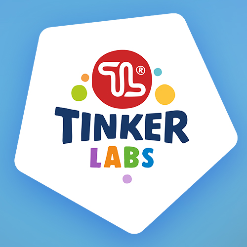
Decorative logo
Only for display on larger surfaces
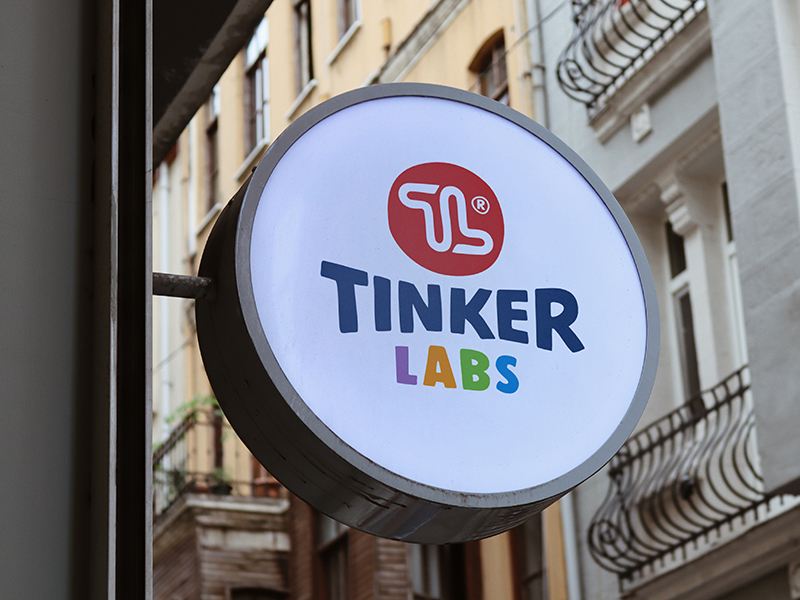
Primary logo
Street sign
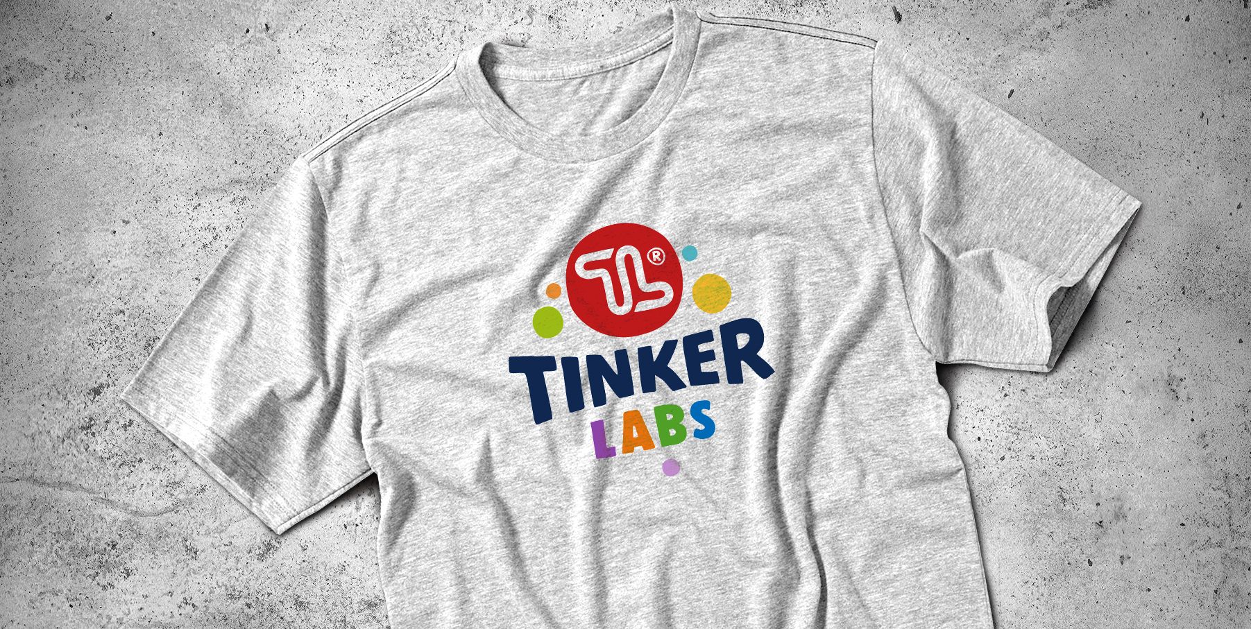
T-shirt
Logo with decorative elements
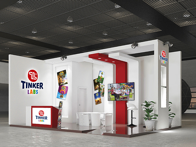
Fair stand
Versatile use
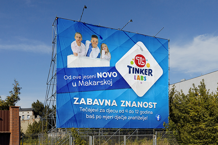
Billboard
Think big
TLC sticker
Glass sign
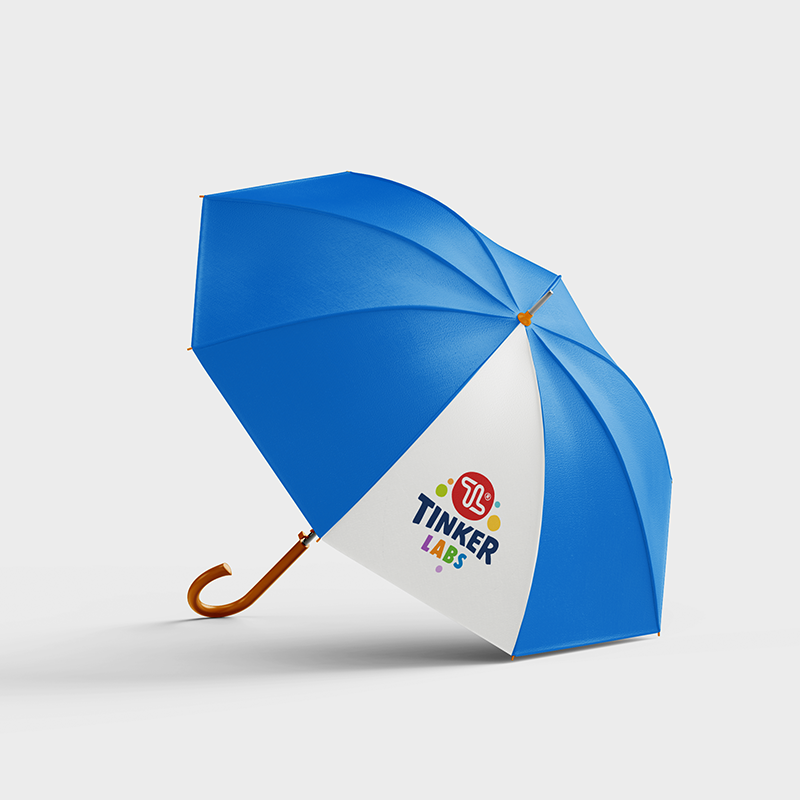
Umbrella
Decorative logo
TL symbol
For very small applications
Volume
Size & minimal space
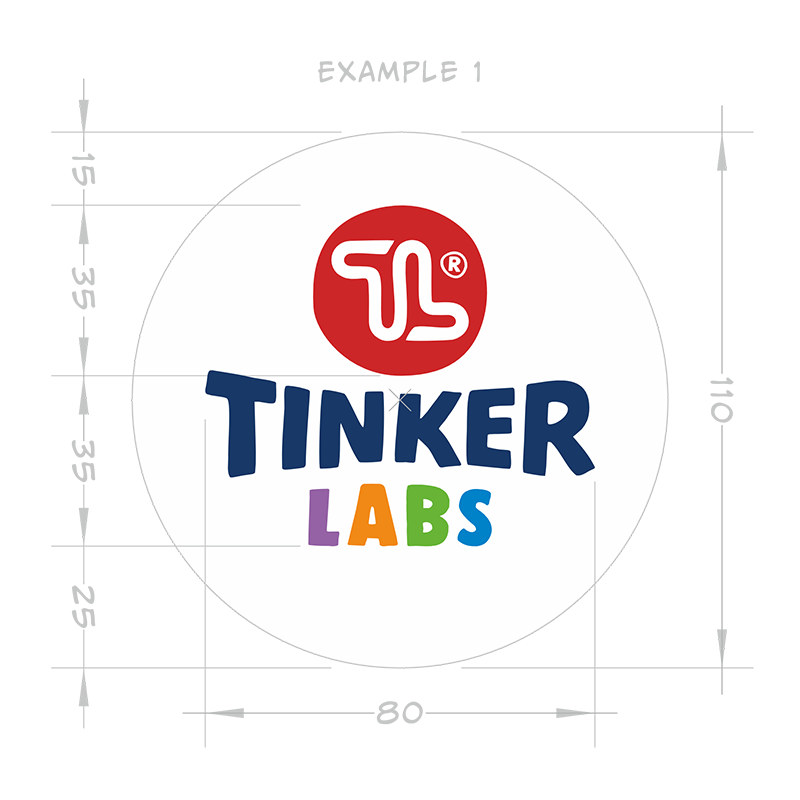
The logotype has some mathematical ratios that can be expressed in rounded measurements as in example 1, but the actual size of the display will depend on the format of the document, poster or, for example, the T-shirt size to which it is applied, trying to determine the optimal size of the space.
Apart from some predefined cases, the logo must not contain artistically demanding elements, decorations, or text. The empty space around the logo should be large enough so that the logo does not get lost in the multitude of details or colors. The background on which the logo is displayed is almost always white. Rarely, in monochromatic high-contrast displays, the background may be a different color.
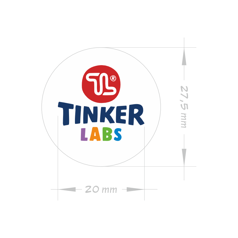
On dark or colorful backgrounds, white predefined geometric shapes are used under the logo. Additional space should also be left around them. The background in this type of display can be rotated only to enhance the visual appeal of the display and to make the best use of the background on which the logo is applied. The physical representation of the logo must not be less than 20 mm in width without minimum space (example 2) or 120 pixels in cases of digital, or screen display.
Brand colors
Tinker Labs paletteThe Tinker color palette (table A) is made up of 6 basic colors and they must all be clearly recognizable in a multi-colored display. It is preferable that the colors found in the logo are also used for backgrounds or decorative elements found on promotional materials. Secondary colors (lighter shades – 3, 4, 5, 7 and 11) can also be used for these purposes.
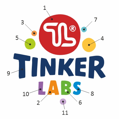
Table A
| C | M | Y | K | R | G | B | # | Pantone | RAL Classic | |
| 1 | 15 | 100 | 100 | 0 | 205 | 38 | 40 | CD2628 | 711 C | 3020 |
| 2 | 0 | 55 | 100 | 0 | 241 | 137 | 23 | F18917 | 1495 C | 1007 |
| 3 | 0 | 45 | 80 | 0 | 245 | 160 | 70 | F5A046 | 157 C | 1034 |
| 4 | 0 | 25 | 85 | 0 | 252 | 197 | 59 | FCC53B | 1225 C | 1021 |
| 5 | 40 | 0 | 100 | 0 | 176 | 203 | 30 | B0CB1F | 2290 C | 6039 |
| 6 | 65 | 0 | 100 | 0 | 103 | 180 | 55 | 67B437 | 3501 C | 6038 |
| 7 | 60 | 0 | 20 | 0 | 102 | 195 | 208 | 66C3D0 | 305 C | 6027 |
| 8 | 100 | 25 | 0 | 0 | 0 | 136 | 206 | 0088CE | 2394 C | 5012 |
| 9 | 100 | 70 | 0 | 50 | 24 | 56 | 103 | 183867 | 294 C | 5003 |
| 10 | 50 | 70 | 0 | 0 | 160 | 99 | 180 | A064B4 | 2583 C | 4008 |
| 11 | 25 | 40 | 0 | 0 | 212 | 172 | 224 | D4ACE0 | 2563 C | 70% 4008 + 30% White |
Monochrome applications
Positive and negative
The logo has its monochrome variants in positive and negative, which are used when the nature of the application requires it or in cases of technical limitations, such as monochrome printing.
When choosing a color in a monochrome display, wherever possible, darker color variants from the brand color palette are used, and if it is not possible to use them, any other color that will provide a strong contrast with the background and good legibility.
Examples
Gallery
Promotional mug
white on blue
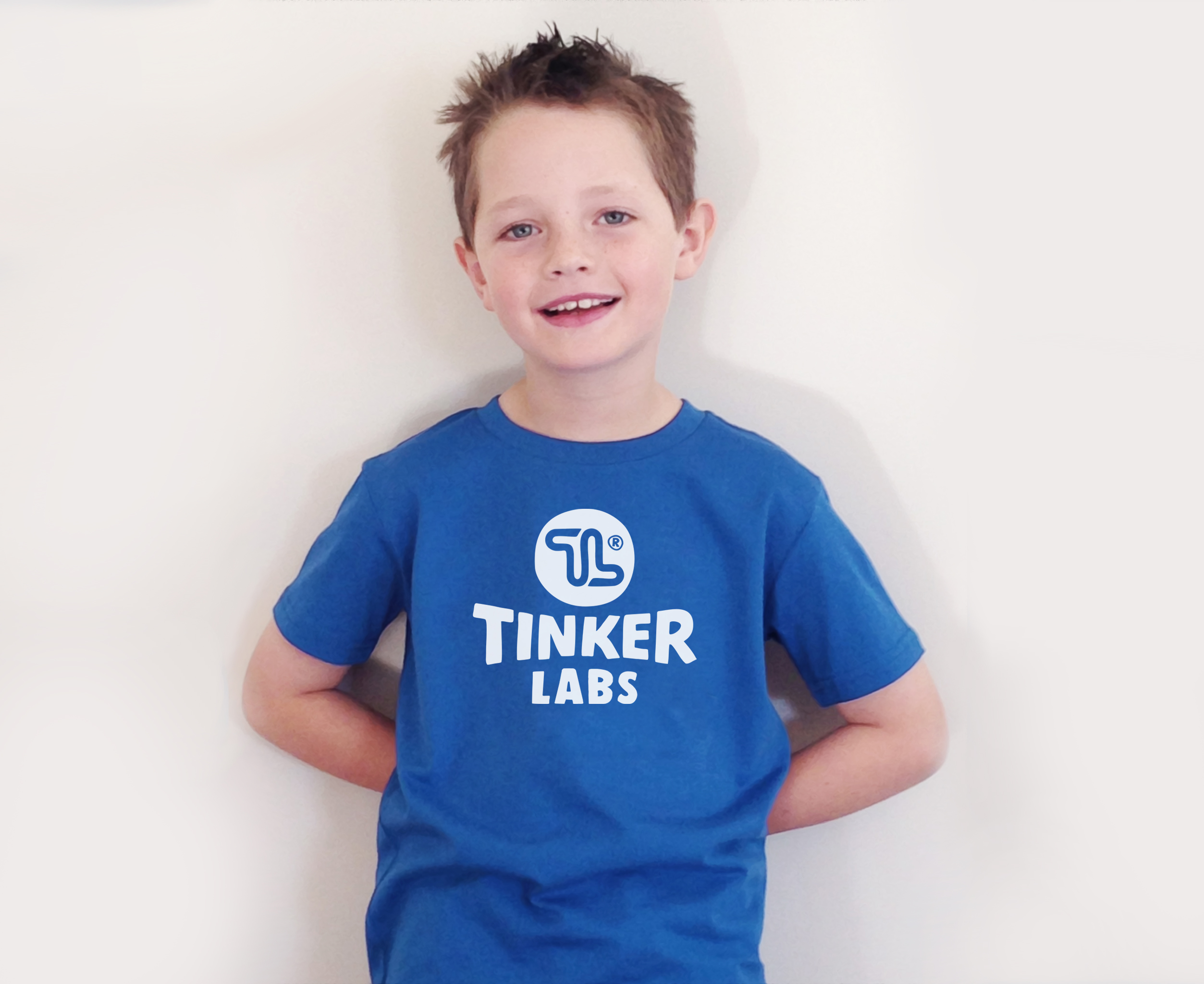
Boys tee
White on dark background
Cut-out label
Sticker
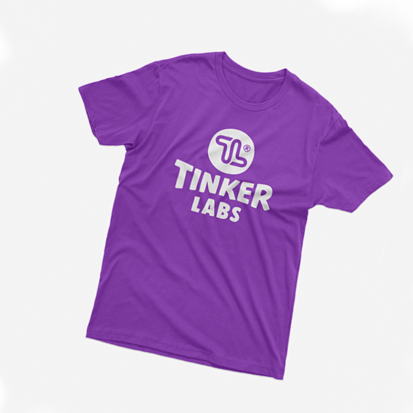
Dark T-shirt
negative
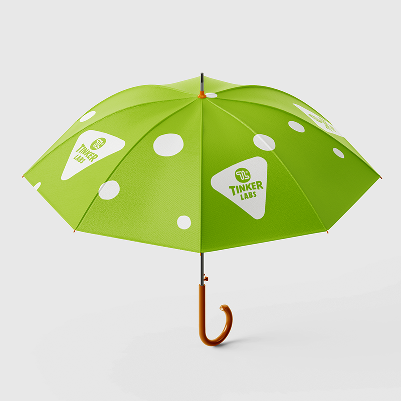
Umbrella
white on chartreuse fabric
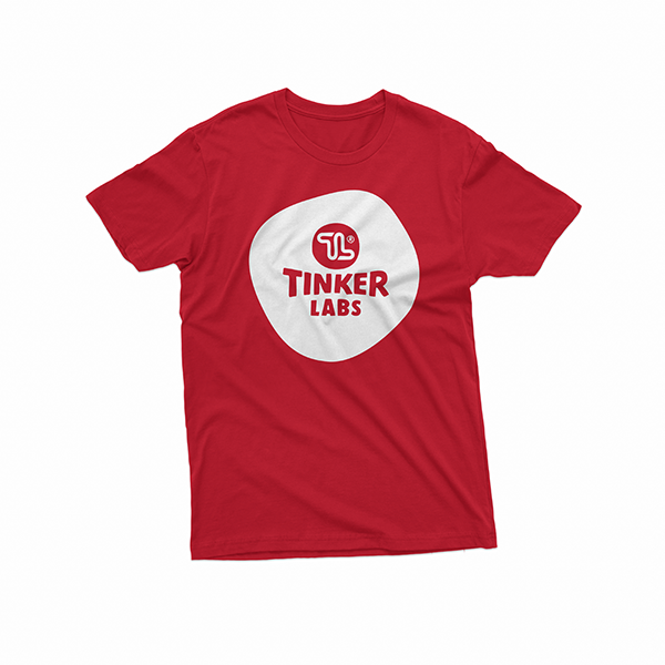
Dark T-shirt
negative with background
Secondary branding
Products, acronyms, and slogansAdditional visual elements in addition to the formal logo are labels of each course or other product that Tinker Labs offers. There is the acronym STEAM (science, technology, engineering, art & math) which best reflects the philosophy of the learning approach that we represent. Frequent headlines and informational messages that appear on promotional materials have also received their standard graphic features.
These elements should be carefully combined with the logo and other graphic content in such a way as to convey the desired message to the target audience using a minimum of elements, whether it was printed or digital communication media.
Visual standardization should help with communication here. An overabundance of these elements, on the other hand, can mute the desired message, so it should be used sparingly.
Examples
Gallery
TL stamp
TL approved

STEAM
Full . . . . . ahead!
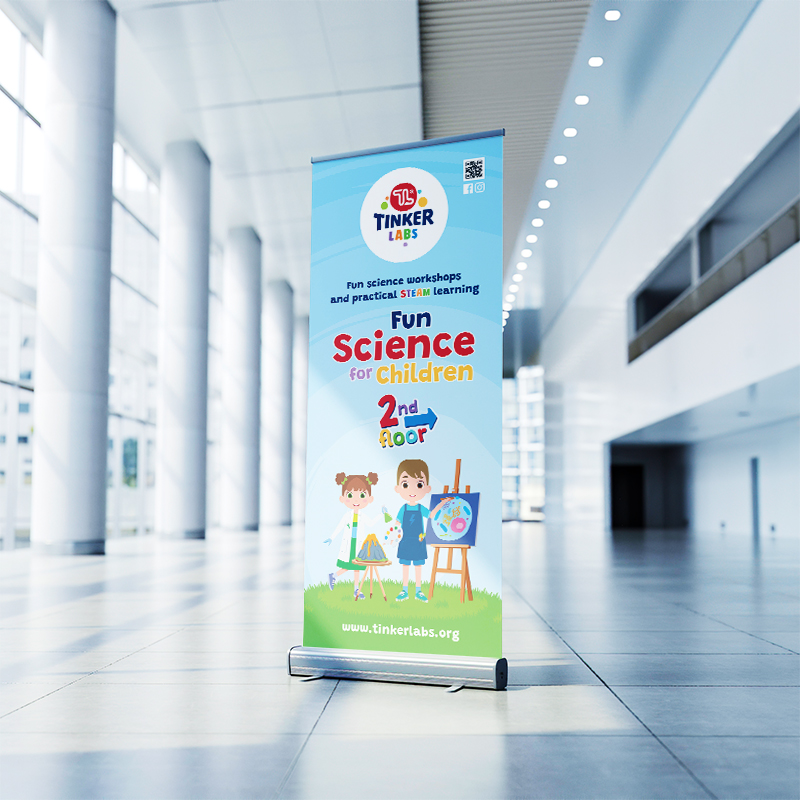
Roll-up design
when there is not much time to read
Tinker Camp
Products
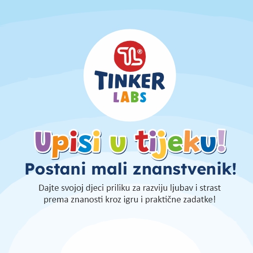
More text - Croatian
Logo, headline & text
Tinker Birthday
Products
use of visual identity elements
Brand philosophy and strategy
Tinker Labs d.o.o. is a company founded in Croatia, holder of a global franchise system aimed at raising creativity and critical thinking in children while introducing the interdisciplinarity of the STEAM approach. The primary activity is the creation of original education programs and the organization of specialized learning centers that implement such programs.
As a global brand that wants to separate its specific educational methods from similar competitive attempts and the formal school system, it develops its own marketing methods in which visual identity elements play an important role. The primary element of that identity is the logo, without which the stimulation of originality and diversity is unthinkable.
Consistency is the most important value of recognition. Visual identity loses its meaning without it, and therefore it should not be abandoned at any time. The visuality of the brand will certainly adapt to the times, audience, and business goals, as well as the philosophy of the brand, and the success of these processes will certainly depend on its consistency.
This guide is intended primarily for graphic, web and other designers and marketing professionals who need help in using visual identity elements when creating promotional content that represents the Tinker Labs brand. This overview will also help users of franchise licenses in raising awareness of the importance of the uniformity of such a business system and the proper use of the primary elements of promotion in everyday communication.
These instructions will not show all possible examples of using the visual identity, which is impossible, but serve as a guide in the proper use of the logo and show some examples of inappropriate or unacceptable use. The manual should leave enough space and freedom for professionals to create promotional and communication content that represents the brand, but also clearly define which direction should not be taken.
Farewell
to an old friend
From 2017 to 2023, a logo was used, the visual of which tried to reconcile the strict business structure of a franchise system and the more casual educational system, which is the structural activity and the main carrier of the Tinker Labs business model. The application of that visual identity outgrew the possibilities of a consistent and clear presentation of the brand with those visuals, and it was necessary to move on. From the old logo, only the recognizable artistic part representing the joined letters TL was taken over. This time the sign is less formal, softened and removed from the strict geometric structure. Apart from that part, the new sign is entirely made from scratch.
In the process of developing this new logo, special care was taken to adequately represent the primary activity. We were looking for a more relaxed way of visual communication, sufficiently readable and clear in a business environment, and interesting and playful for the end users of the system – children. With its more informal appearance, the logo is also close to the educational philosophy of Tinker Labs, which puts the postulate “From play, to passion, to purpose” as the starting point of its curriculum.
Branding
Download ©
Download and store all materials for possible offline use
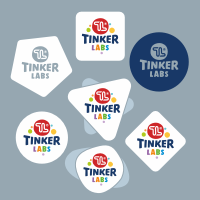
All vector logos in one document
Download the PDF document with all versions of the CMYK/vector logo, also in the ZIP container all those versions are ready in EPS format.
Basic logo ©
Versions of the base logo on different background shapes
Basic logo
Basic logo - V1
Basic logo - V2
Basic logo - V3
Basic logo - V4
Basic logo - V5
Basic logo - V6
Basic logo with decorative elements ©
Only for application on larger surfaces. Versions of the base logo on different background shapes
Decorative logo
Decorative logo - V1
Decorative logo - V2
Decorative logo - V3
Decorative logo - V4
Decorative logo - V5
Decorative logo - V6
Monochromatic logo positive/negative ©
Use on contrasting surfaces in positive or negative following the TL palette.
Monochromatic logo
Monochromatic logo - V1
Monochromatic logo - V2
Monochromatic logo - V3
Monochromatic logo - V4
Monochromatic logo - V5
Monochromatic logo - V6
Secondary branding elements ©
Products and acronyms for use with logo

STEAM logo - V1
Tinker Camp logo - V1
Tinker Birthday logo - V1
PROGRAM BRANDING
Courses
Tinker Labs currently offers 7 courses for children of different ages. We created logos to present the courses that are used on websites, social media or in the press of various publications. Depending on the need, raster and vector formats are available here. If multiple logos are used on the materials, their sizes must not differ.
